
Pop Ratio
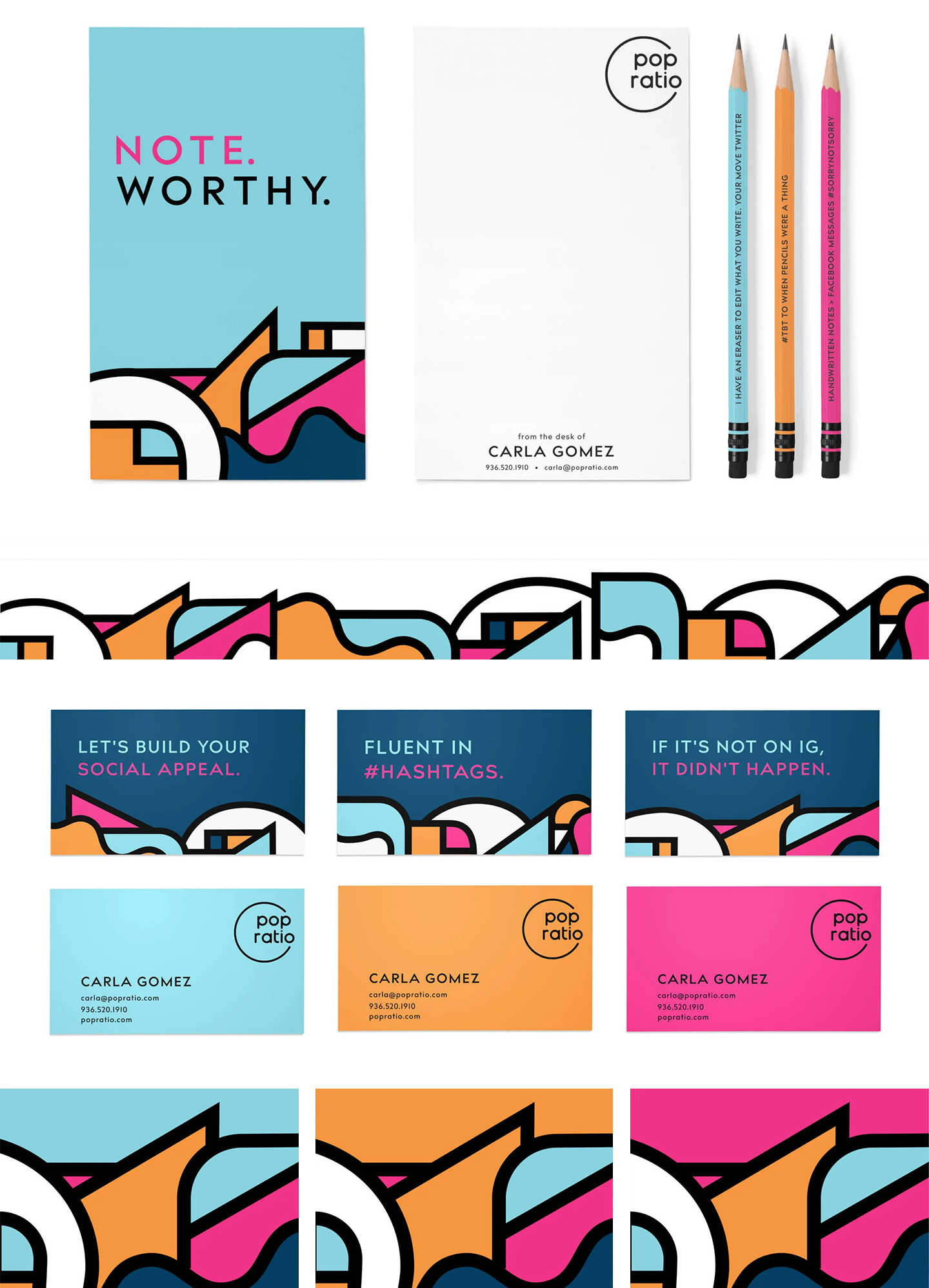
When Chief Engagement Officer, Carla Gomez, approached us about naming and branding her new PR & Social Media company, we did a mental fist pump. Carla is an avid art lover, well-traveled, and always smiling. So of course we wanted her new brand to “pop”. The name stems from Latin roots of Populous and Ratio that means “people” and “relationship”. And so, Pop Ratio was born. We used thick black lines paying homage to one of Carla’s favorite artists, Keith Haring, as well as to represent her strong connections with people. The bright colors represent Carla's “pop” of energy and bright outlook. Cap that off with some clever copy and we have a winner.
Agency: Test Monki
Creative Director: Suzy Simmons
Designer: Sofi Cruz